
Part 2. The 150 Artist Atlas
From 'Visual Identity in Modern Music' - an AI-authored book produced on Comuvia's BookWriter system. Each chapter below is shown as its Comuvia Classification poster with a one-paragraph synopsis.
Chapter 5. Pop: Era-Based Identity Systems
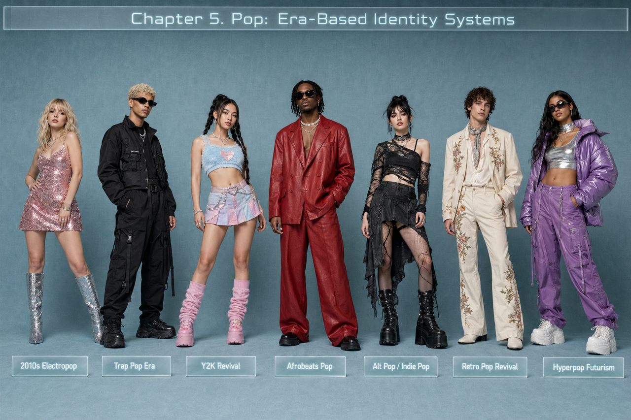
Pop relies on tightly defined “eras” because mass attention and fast cultural turnover make visual sameness easy to ignore. An era acts as a clear promise to audiences, giving fans a shared ritual they can copy through outfits, filters, memes, and concert dress codes. Instead of a single fixed logo, pop identity becomes a sequence of cohesive micro-brands that signal change while staying recognizably the same artist. Build an era through constraints that repeat: a dominant silhouette for instant recognition, a limited color range with a distinct accent, and materials chosen for how they read under stage lighting and phone cameras. Identity also includes persona and camera behavior—movement rules, eye contact, and tone—kept consistent across polished shoots and “casual” posts. Ensure the system scales to streaming tiles, fast-scrolling social motifs, and immersive stage worlds.
Chapter 6. Hip-Hop: Persona, Power, and Symbolism
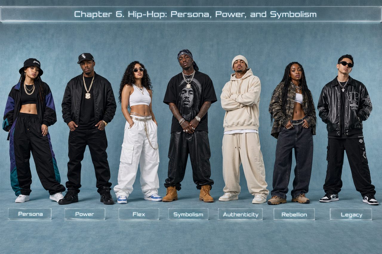
Hip-hop visual identity functions as a readable power system: it makes status instantly legible through silhouette, posture, jewelry, cars, entourage, locations, and typography, answering who holds power and why. With artists controlling always-on feeds, the persona must stay consistent across clips, paparazzi, livestreams, court steps, campaigns, and tour footage, so the strongest identities operate like symbols—simple, flexible, and charged with meaning beyond style. Three recurring visual levers do the work: ownership signals that act as repeated “proof,” threat-and-protection cues that project authority through shields, distance, and controlled access, and territory markers that translate local codes into globally recognizable shorthand. Two scalable persona approaches stand out: mogul-minimalism, where restraint reads as assumed wealth but needs a distinct differentiator, and street-myth world-building, where motifs turn biography into legend, though symbolism must feel earned and coherent over time.
Chapter 8. Latin & Afrobeats: Color, Rhythm, and Cultural Codes
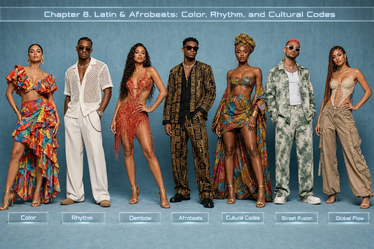
Latin and Afrobeats succeed visually by prioritizing immediacy: saturated color, kinetic styling, expressive bodies, and lived-in environments that communicate joy, sensuality, pride, and resilience across language barriers. Identity is “body-first,” with choreography, posture, and camera-blocking functioning like logos, so creative direction must test how looks perform in motion, sweat, and crowd mirroring. Visual density beats minimalism through texture details that survive compressed video. Community is part of the brand, using crews and neighborhood scenes to signal warmth and credibility. Cultural reference works best as a consistent system rooted in daily reality, not exotic costume; local specificity becomes a global advantage. Three repeatable archetypes emerge: street-lux mobility, carnival-scale spectacle, and “minimal heat” restraint. Color choices map to geography and mood, often balancing day warmth with night cool.
Chapter 9. K-pop: Industrialized Visual Perfection
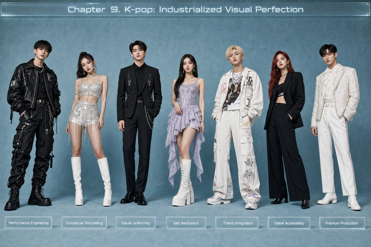
K-pop treats visual identity as infrastructure: a scalable system that turns music into a coherent, fast-refreshing product across videos, stages, social feeds, variety content, merch, and brand campaigns. Cohesion comes from a layered “visual stack”: durable group DNA (silhouette rules, choreography signature, attitude, polish), a tightly art-directed era concept with controlled color and graphics, distinct member lanes that create easy entry points for fans, and platform-specific variants that adapt to different camera realities without breaking recognition. “Perfection” functions as conversion: high readability in thumbnails, synchronized choreography as brand authority and meme engine, and manufacturing-level consistency through scheduling and unified art direction. Personas work as a two-mode funnel—elevated stage character plus an approachable but still designed social self—while mixing archetypes lets one group satisfy multiple audience desires at once.
Chapter 11. Indie & Alternative: Anti-Brand as Brand
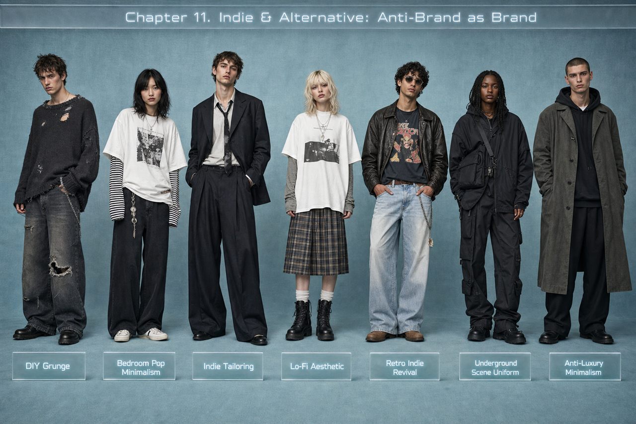
Indie and alternative visuals turn “not trying” into a repeatable identity: branding that looks private, improvised, and anti-corporate while staying consistent enough to read instantly on thumbnails, social clips, and stage. Credibility is the main value, signaled through deliberate underdesign, bootleg-like merch, and typography or layouts that feel slightly wrong by choice. The image often avoids a single hero shot, using distance, blur, cropping, or shadow to reduce celebrity and increase intimacy. Specific, lived-in details replace spectacle, and casual stage behavior becomes a controlled signature. A durable system typically combines comfort-armor silhouettes and thrifted textures, muted palettes with one recurring accent, a persona built on controlled access (relatable diarist or elusive author), and “evidence” media textures like flash candid photos, collage, and lo-fi video. The practical takeaway is to design restraint with one unmistakable gesture that stays recognizable at a glance.